The Feedback on the Best Logo
What makes a logo iconic?

NASA
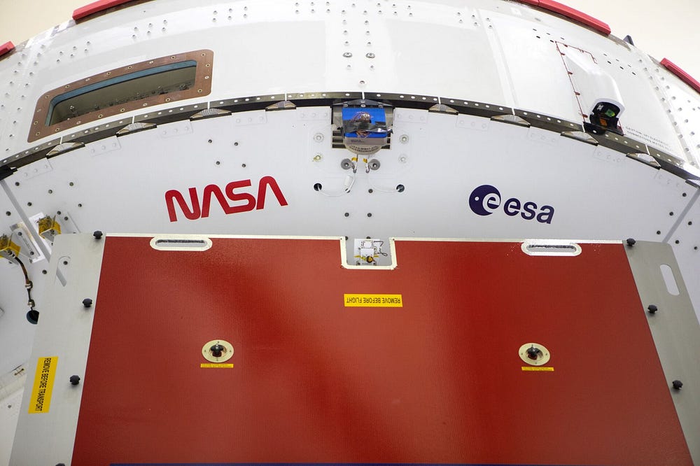
In 1974, as part of the Federal Graphics Improvement Program of the National Endowment for the Arts, NASA hired Richard Danne and Bruce Blackburn to design a more modern logo. In 1975, the agency switched to the modernist NASA logotype, nicknamed “the worm”, a red, stylized rendering of the letters N-A-S-A. The horizontal bars on the A’s are removed in the worm logo. — wikipedia.org
The original name for the office was National Advisory Committee for Aeronautics (NACA). Aeronautics is the science or art involved with the study, design, and manufacturing of air flight–capable machines, and the techniques of operating aircraft and rockets within the atmosphere.
Knowing the origin and definition, you can understand the thinking behind the Richard Danne and Bruce Blackburn logo. The “worm” logo is absolutely beautiful. The linearity and removal of all ornaments in the font gives a sense of pure smooth motion. The choice of the red color is perfect for contrast against all the white “air flight–capable machines, aircraft, and rockets”. The simplicity of only using lettermark without any need for pictorial or even wordmark is what makes it effortless and cost-effective. The minimalism in the custom font design makes it timeless. It worked when it was first introduced, during the twenty-year span in production, and now making a come back in 2020. NASA Graphics Standards Manual was one of the first comprehensive design systems ever created. I can only assume some influence came from another great logo that came before it, the 1972 8-bar IBM logo designed by Paul Rand. I also think the NASA “the worm” logo was likely the influential predecessor to the prominant CNN logo.
